Friday, September 22, 2017

Composition 4

Symmetry
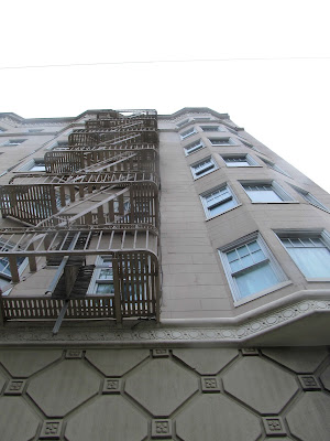
Symmetry is when a photo is almost identical on the same side. If the photo were to be cut in half, then the image would be almost an exact replica. For these photos, I chose to look at a lot of architecture.


Asymmetry:
Asymmetry is similar to symmetry however the objects have a different weight and/or size. Some of my photos are in color because I felt that it would better demonstrate the differences in weight and size.


Balance:
Balance is similar to both asymmetry and symmetry in the sense that the objects could be the same or similar in shape but have different weight. I chose to edit my photos using color because I thought it extenuated the different weights of the objects.


Friday, September 15, 2017

Pictorial Lines

Lines Leading to a Subject: These lines are similar to leading lines in the sense that the line draws the viewer to a point, however, these lines point to a subject.


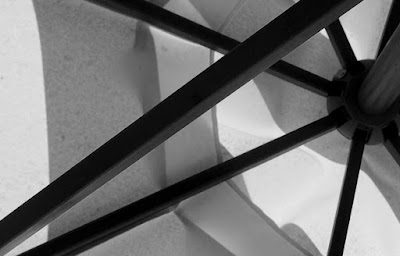
Arrangement: Arrangement is when the lines are the prominent subject in the photo. If the lines were to be taken away from the photo, then there wouldn't be another main subject in the photo and the background would be plain.


Decorative: Decorative lines are used to add more detail to the photo and if they were to be taken away, the main subject is still clear.


Saturday, September 9, 2017

Depth

Depth Staging: 
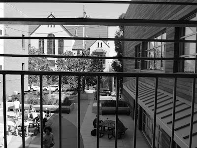
Depth staging is when there are two or more subjects in the photo however there is a distinct spacial difference between the subjects. Typically, the main subject is in the foreground of the photo while the others are in the background. For this technique, I chose to focus on people and observing the difference in space between them.


Leading Lines: 
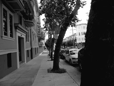
Leading lines are used to help draw a viewer through the photo to the main subject which is at the end of the line. Many of the photos are of sidewalks which I think make it easiest to demonstrate this technique.  


Repetition:
Repetition is when something is being repeated throughout the photo and gets smaller and blurry as it continues. For this technique, I chose to photograph objects that had the same pattern and captured them in a way that demonstrated their depth.


Friday, September 1, 2017

Composition 1

Diagonal is when the image has the shape of a diagonal line or curves in a way in which a diagonal line can be outlined.


Triangle is a photo style where the photo is positioned in the shape of a triangle or has a triangle outline to it.


Rule of Thirds is when the focus on the photo is on one third of the image, usually on the edges.


Best of Spring Series

These photos are the ones that I thought were the best of my spring series and really exemplified the goals of my project. Throughout the se...